
On the site of the Texas Department of Criminal Justice there’s a page which lists all the people that have been executed since 1982, when the death penalty was reinstated, along with their last statement. The data is here. In this project we are going to explore the data and see if we can apply topic modeling to the statements.
Setup
We are going to use the following packages:
scrapyto scrape the datanumpyandpandasfor the data manipulationaltairto create plots, and occasionallymatplotlibgmapsto create a heat map over a Google Maptextblobfor sentiment analysisscikit-learnto do topic modelinggensimfor additional topic modeling
import numpy as np
import pandas as pd
import matplotlib.pyplot as plt
from altair import Chart, X, Y, Axis, Scale, Color, Bin, SortField, Column, Formula

# Two convenience functions to work with Altair and Matplotlib
def show(*charts, width=700, height=300):
    for chart in charts:
        chart.configure_cell(width=width, height=height).display()

def pie(ax, *args, **kwargs):
    patches, _, _ = ax.pie(
        *args,
        colors=['#BEE9E8', '#62B6CB', '#5FA8D3', '#DCEDEC'],
        autopct='%1.1f%%',
        **kwargs
    )
    for p in patches:
        p.set_linewidth(0.6)
    ax.axis('equal')
Scraping the data
I used Scrapy to obtain all the data. In the first iteration of this project I was using requests and BeautifulSoup. However, the code quickly became messy and even though I was using concurrent.futures to send asynchronous requests it was unbearably slow. Hence my decision to switch to Scrapy. I had already used it, and it’s really easy to setup. I won’t post the complete code here, because Scrapy requires a whole project to run. The important part is the spider, which is contained in a single class. If you’ve already used Scrapy, the code is very easy to follow, with minor adjustments for errors in the original page (see people #416 and #419 for an example).
import scrapy

class TexasDeathSpider(scrapy.Spider):
    name = 'texas_death'
    allowed_domains = ['www.tdcj.state.tx.us']
    start_urls = (
        'https://www.tdcj.state.tx.us/death_row/dr_executed_offenders.html',
    )

    def parse(self, response):
        _, *rows = response.css('table tr')
        fields = ['execution', 'last_name', 'first_name', 'tdcj_number',
                  'age_execution', 'date_execution', 'race', 'county']
        for row in rows:
            item = PersonItem()
            values = row.css('td::text').extract()
            if len(values) > len(fields):
                # Special cases: people #416 and #419
                del values[1]
            for field, value in zip(fields, values):
                item[field] = value.strip()

            info, last_stmt = row.css('td > a::attr(href)').extract()
            no_info = info.endswith(('.jpg', 'no_info_available.html'))
            no_stmt = last_stmt.endswith('no_last_statement.html')
            if no_info:
                item['gender'] = ''
                info = False
            if no_stmt:
                item['last_statement'] = ''

            if no_info and no_stmt:
                yield item
            elif no_stmt:
                yield scrapy.Request(response.urljoin(info),
                                     callback=self.parse_gender,
                                     meta={'item': item})
            else:
                info_url = response.urljoin(info) if info else False
                yield scrapy.Request(response.urljoin(last_stmt),
                                     callback=self.parse_last_stmt,
                                     meta={'item': item,
                                           'info_url': info_url})

    def parse_last_stmt(self, response):
        item = response.meta['item']
        info_url = response.meta['info_url']
        ps = [p.strip() for p in response.css('p::text').extract()
              if p.strip()]
        item['last_statement'] = ps[-1]
        if not info_url:
            yield item
            return
        yield scrapy.Request(
                info_url,
                callback=self.parse_gender,
                meta={'item': item},
        )

    def parse_gender(self, response):
        item = response.meta['item']
        rows = response.css('table tr')
        item['gender'] = rows[10].css('td::text').extract()[-1].strip()
        yield item
The crawler is really fast compared to the previous approach and with Scrapy exporting the data to other formats is relatively painless. I saved all the data in the file texas_death_itmes.csv.
If you read the spider code you’ll have noticed that there are a few special cases. In some cases, there is no additional information. In others the additional information is not in an HTML page but in an image of a scanned document.
Unfortunately many times the additional information is missing and we are served an image instead: I tried to read the text in them with pyocr and tesseract, but I had terrible results. The images are not at all uniform, and in many cases there are spots on the document which confuse the OCR engine. It could make for a challenging project, but since at the moment our goal is different, I decided to abandon the idea and focus on the statements and the available data.
The additional information is rarely present, leaving us with only 151 people with additional information out of 538. I decided to extract only the gender from the additional information, as it’s relatively easy to guess it for the missing people.
Cleaning and processing the data
We’ll now clean the data we have to see if there’s anything interesting in it.
people = pd.read_csv('texas_death_items.csv')
people.info()
<class 'pandas.core.frame.DataFrame'>
RangeIndex: 538 entries, 0 to 537
Data columns (total 10 columns):
execution         538 non-null int64
last_name         538 non-null object
first_name        538 non-null object
tdcj_number       538 non-null int64
gender            151 non-null object
race              538 non-null object
age_execution     538 non-null int64
date_execution    538 non-null object
county            538 non-null object
last_statement    436 non-null object
dtypes: int64(3), object(7)
memory usage: 42.1+ KB
We see that we are only missing the gender and about a hundred statements, from the people who declined to make one.
people.head()
| execution | last_name | first_name | tdcj_number | gender | race | age_execution | date_execution | county | last_statement | |
|---|---|---|---|---|---|---|---|---|---|---|
| 0 | 460 | Powell | David | 612 | NaN | White | 59 | 06/15/2010 | Travis | NaN |
| 1 | 418 | Nenno | Eric | 999188 | NaN | White | 45 | 10/28/2008 | Harris | NaN |
| 2 | 408 | Sonnier | Derrick | 999054 | NaN | Black | 40 | 07/23/2008 | Harris | NaN |
| 3 | 394 | Griffith | Michael | 999176 | NaN | White | 56 | 06/06/2007 | Harris | NaN |
| 4 | 393 | Smith | Charles | 953 | NaN | White | 41 | 05/16/2007 | Pecos | NaN |
Let’s start by processing the dates.
people.date_execution.map(len).value_counts()
10    536
9       2
Name: date_execution, dtype: int64
The two dates which are nine characters long could be malformed, let’s check.
people.date_execution[people.date_execution.map(len) == 9]
425    11/6/2008
536    10/6/2015
Name: date_execution, dtype: object
It turns out they aren’t malformed, so we can process them in bulk.
import datetime

def _read_date(date):
    return datetime.datetime.strptime(date, '%m/%d/%Y')

people.date_execution = people.date_execution.map(_read_date)
The gender column is a bit more complicated to fill, since in theory there are a few names that are considered ‘unisex’ (babynameguide.com has a comprehensive list UPDATE (2022): the site is no longer operational). Let’s check the names of the people for which we are missing the gender.
people.gender.replace('male', 'Male', inplace=True)
known_names = dict(people[['first_name', 'gender']].dropna().values)
names = people.first_name[people[['first_name', 'gender']].isnull().any(axis=1)]
len(names.unique()), len(names)
(204, 387)
First of all, we’ll use the information we already have to infer the gender of the other people:
known_names = dict(people[['first_name', 'gender']].dropna().values)
For the remaining names we’ll use the package SexMachine. Note that it does not work on Python 3, and I had to manually change a couple of lines of code.
from sexmachine.detector import Detector
d = Detector()
The detector returns mostly_{gender} when it’s not sure. Since almost the totality of executed people are male, in our case we can safely interpret mostly_male as male. We have to manually check the rest. (Note: here andy means androgynous, i.e. what I called ‘unisex’ name before.)
remaining = set()
for name in names.unique():
    gender = d.get_gender(name).split('_')[-1]
    if gender == 'male':
        known_names[name] = 'Male'
        continue
    remaining.add(name)
    print('{} -> {}'.format(name, gender))
Marion -> female
Jessie -> female
Caruthers -> andy
Ponchai -> andy
Betty -> female
Clydell -> andy
Excell -> andy
Lesley -> andy
Esequel -> andy
Kavin -> andy
G.W. -> andy
Markum -> andy
Denton -> andy
Hai -> andy
Dorsie -> andy
Irineo -> andy
Jessel -> andy
Aua -> andy
Karla -> female
Sammie -> andy
Orien -> andy
Stacey -> female
Jermarr -> andy
Ronford -> andy
T.J. -> andy
Toronto -> andy
Alva -> andy
Kia -> female
Kelsey -> female
Dominique -> andy
Shannon -> andy
Jaime -> andy
Jackie -> andy
Mauriceo -> andy
Farley -> andy
Lionell -> andy
Daroyce -> andy
Elkie -> andy
Jamie -> female
I checked each one by hand on the TDCJ page, and as expected they’re all male except two: Betty and Karla.
for name in remaining:
    known_names[name] = 'Male'
known_names['Betty'] = 'Female'
known_names['Karla'] = 'Female'

people.gender = people.apply(
    lambda row: known_names.get(row.first_name, row.gender),
    axis=1,
)
people.gender.value_counts(dropna=False)
Male      533
Female      5
Name: gender, dtype: int64
people.info()
<class 'pandas.core.frame.DataFrame'>
RangeIndex: 538 entries, 0 to 537
Data columns (total 10 columns):
execution         538 non-null int64
last_name         538 non-null object
first_name        538 non-null object
tdcj_number       538 non-null int64
gender            538 non-null object
race              538 non-null object
age_execution     538 non-null int64
date_execution    538 non-null datetime64[ns]
county            538 non-null object
last_statement    436 non-null object
dtypes: datetime64[ns](1), int64(3), object(6)
memory usage: 42.1+ KB
Data visualization
We’ll first observe the general characteristics of the dataset by visualizing the most important ones.
Distribution of race, age and sex
Let’s start by plotting the race distribution as a pie chart.
race_counts = people['race'].value_counts().reset_index()
race_counts.columns = ['race', 'count']
pop = pd.DataFrame({'race': ['White', 'Black', 'Hispanic', 'Other'], 'count': [196817552, 37685848, 50477594, 23764544]})
fig, (ax1, ax2) = plt.subplots(ncols=2, figsize=(10, 6))
pie(ax1, race_counts['count'], labels=race_counts['race'])
pie(ax2, pop['count'], labels=pop['race'])
ax1.set_title('Race distribution among executed people')
ax2.set_title('Race distribution among U.S. population (2010)')
fig.subplots_adjust(wspace=0.5)
plt.show(fig)
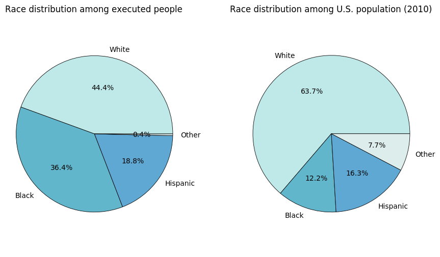
The population data was taken from the 2010 US Census (PDF). It’s pretty clear that White people are underrepresented in the death row data, while Black people are considerably overrepresented. People of Hispanic descent are roughly proportional. Although it would be very interesting to investigate into the causes of this disproportion, we have too little data and our main goal is to analyze the statements, so we will not venture further.
Let’s visualize the age with respect to race.
show(Chart(people[['race', 'age_execution']]).mark_bar().encode(
        column=Column('age_execution',
                      bin=Bin(maxbins=10)),
        x=X('race',
            axis=Axis(labels=False, tickSize=0, titleFontSize=0),
            scale=Scale(bandSize=10)),
        y='count(*)',
        color='race',
    ).configure_facet_cell(strokeWidth=0))
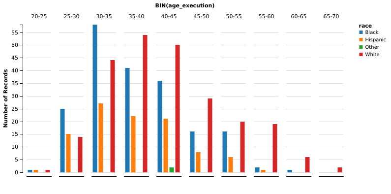
It’s very interesting to note that black people are generally younger than white people at the time of the execution. We could think that white people tend to commit violent crimes at an older age, compared with the crimes committed by black people. However, we have to remember that the age in the chart is the age at the time of execution, not the age at the time of the crime. Many inmates sit on the death row for quite a long time. The Texas Department of Criminal Justice has a page with some statistics. We see that the average time on death row prior to execution is almost 11 years. The page doesn’t provide the variance in the data, but lists the more extreme cases: 252 days is the shortest time, while 11 575 days (that is, 31 years) is the longest time recorded.
Also interesting is the distribution of gender:
show(Chart(people[['race', 'gender']].dropna()).mark_bar().encode(
        x='count(*)',
        y=Y('race',
            sort=SortField('count(*)', op='mean', order='descending')),
        color='gender',
    ), width=600)
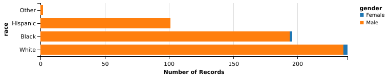
Not surprisingly, the overwhelming majority of executed offenders is male. That is because under Texas statutes death penalty is generally sought for murders, and men are more likely to commit a violent crime (data from this survey (PDF) from the U.S. department of Justice, table 38). As to why is it so, it is still debated. Wikipedia enumerates some of the current theories, with references if you desire to read further. An interesting quote from the linked paragraph is reported here:
Another 2011 review published in the journal of Aggression and Violent Behavior also found that although minor domestic violence was equal, more severe violence was perpetrated by men.
Statement length
We’ll count the number of sentences in each statement. We’ll make use of the amazing package textblob, which has a better API than nltk but uses it behind the scenes. We store the blobs because we’ll need them later as well.
import textblob

statements = people.last_statement.dropna()
blobs = statements.map(lambda s: textblob.TextBlob(s))
n_sentences = blobs.map(lambda b: len(b.sentences))
show(Chart(pd.DataFrame({'Number of sentences': n_sentences})).mark_bar().encode(
        x='Number of sentences:N',
        y='count(*)',
    ))
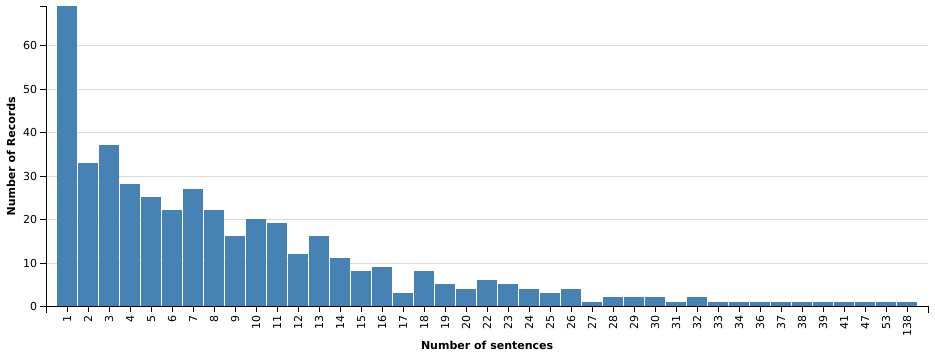
The distribution of the number of sentences is skewed to the left, favoring shorter statements. There’s one statement that separates itself from the rest: it is much longer than all the others, at 138 sentences. Out of curiosity, let’s investigate a bit:
len(blobs[n_sentences.argmax()].words)
1294
people[['last_name', 'first_name', 'race', 'date_execution']].ix[n_sentences.argmax()]
last_name                      Graham
first_name                       Gary
race                            Black
date_execution    2000-06-22 00:00:00
Name: 258, dtype: object
The statement is from Shaka Sankofa, a.k.a. Gary Graham, who was found guilty in a controversial process in the nineties. His supporters brought his case to international attention. Here are the first words of his statement:
I would like to say that I did not kill Bobby Lambert. That I’m an innocent black man that is being murdered. This is a lynching that is happening in America tonight. There’s overwhelming and compelling evidence of my defense that has never been heard in any court of America. What is happening here is an outrage for any civilized country to anybody anywhere to look at what’s happening here is wrong. I thank all of the people that have rallied to my cause. They’ve been standing in support of me. Who have finished with me. I say to Mr. Lambert’s family, I did not kill Bobby Lambert. You are pursuing the execution of an innocent man. I want to express my sincere thanks to all of ya’ll. We must continue to move forward and do everything we can to outlaw legal lynching in America.
Although he denied committing the murder until his very end, he admitted that at the time of Lambert’s death he was on a week-long spree of armed robberies, assaults, attempted murders and one rape. Wikipedia has a page on him if you wish to read more.
Number of executions per year
For this one, a line chart is a better fit.
people['year_execution'] = people.date_execution.map(lambda d: d.year)
show(Chart(people).mark_line().encode(
        x=X('year_execution',
            axis=Axis(format='f'),
            scale=Scale(zero=False)),
        y='count(*)',
    ))
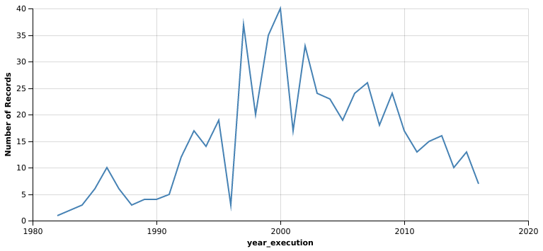
It looks like executions peaked in year 2000 at 40. That’s quite a lot: about one every 9 days. Year 2000 has been called ‘A Watershed Year of Change’, because numerous exonerations revealed persistent errors in the administration of capital punishment and increased public awareness. Many capital punishment advocates changed their mind and joined the growing movement that called for reforms and ultimately the abolishment of death penalty. This also serves as a good explanation for the downward trend that follows year 2000.
Crimes map
We’ll make a heat map of the counties where the crimes were committed, and for that we’ll need the geographic centre of each county. I found an extremely useful table curated by the Wikipedia user Michael J, which among a wealth of other data also has coordinates for each county. The table is available here.
Since there are no links to follow, a whole Scrapy spider is redundant, but we’ll use the convenient Scrapy selector.
import scrapy
import requests

counties = []
body = scrapy.Selector(
    text=requests.get('https://en.wikipedia.org/wiki/User:Michael_J/County_table').text
)
_, *rows = body.css('table tr')
for row in rows:
    cols = row.css('td ::text').extract()
    if cols[1] == 'TX':
        lat, long = map(lambda i: i.strip('°').replace('\u2013', '-'), cols[-2:])
        counties.append((cols[3], lat, long))
counties = pd.DataFrame(counties, columns=['county', 'lat', 'lon'])
counties.lat = pd.to_numeric(counties.lat)
counties.lon = pd.to_numeric(counties.lon)
Now we have the coordinates of each county:
counties.head()
| county | lat | lon | |
|---|---|---|---|
| 0 | Anderson | 31.841266 | -95.661744 |
| 1 | Andrews | 32.312258 | -102.640206 |
| 2 | Angelina | 31.251951 | -94.611056 |
| 3 | Aransas | 28.104225 | -96.977983 |
| 4 | Archer | 33.616305 | -98.687267 |
We just have to group our data with respect to the county,
county_count = people.groupby(people.county).size().reset_index(name='count')
county_count.head()
| county | count | |
|---|---|---|
| 0 | Anderson | 4 |
| 1 | Aransas | 1 |
| 2 | Atascosa | 1 |
| 3 | Bailey | 1 |
| 4 | Bastrop | 1 |
and merge the two dataframes:
county_data = county_count.merge(counties, on='county')
county_data.head()
| county | count | lat | lon | |
|---|---|---|---|---|
| 0 | Anderson | 4 | 31.841266 | -95.661744 |
| 1 | Aransas | 1 | 28.104225 | -96.977983 |
| 2 | Atascosa | 1 | 28.894296 | -98.528187 |
| 3 | Bailey | 1 | 34.067521 | -102.830345 |
| 4 | Bastrop | 1 | 30.103128 | -97.311859 |
The heat map is drawn as a layer over a Google Map. In a Jupyter notebook this is rendered as an interactive map. Unfortunately, in the exported notebook the map is only an image.
import os
import gmaps

gmaps.configure(api_key=os.environ['GMAPS_API_KEY'])
m = gmaps.Map()
data = county_data[['lat', 'lon', 'count']].values.tolist()
heatmap = gmaps.WeightedHeatmap(data=data, point_radius=30)
m.add_layer(heatmap)
m
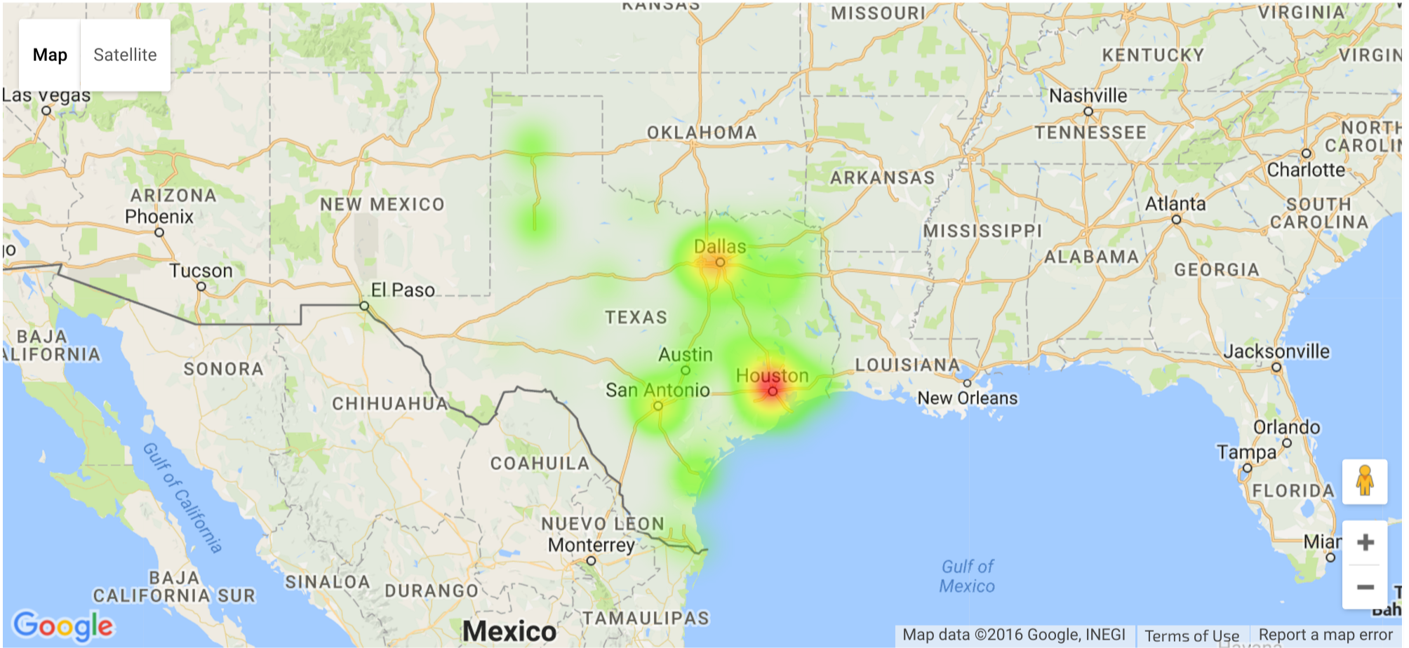
It’s evident that violent crimes leading to death penalties peak in the largest cities. Comparing this data with the population in Texas, only Austin appears to be an exception It’s the fourth largest city in Texas according to this table, but its county, Travis, isn’t even in the top ten:
county_count.sort_values(by='count', ascending=False).head(10)
| county | count | |
|---|---|---|
| 35 | Harris | 126 |
| 21 | Dallas | 55 |
| 7 | Bexar | 42 |
| 78 | Tarrant | 38 |
| 64 | Nueces | 16 |
| 42 | Jefferson | 15 |
| 59 | Montgomery | 15 |
| 54 | Lubbock | 12 |
| 10 | Brazos | 12 |
| 77 | Smith | 12 |
Data analysis
We finally get to the analysis of the statements, which will be divided in three parts. First we will conduct a very simple frequency analysis, then we will perform some sentiment analysis on the text. Finally we will attempt to organize the statements in clusters.
Frequency analysis
The statements contain some non-ASCII characters, which we will replace for easier processing. There is also spurious text in the form of (Spanish), (English), which is added to specify the language in which the statement was spoken.
try:
    with open('statements.txt') as fobj:
        all_text = fobj.read()
except OSError:
    to_replace = {
        '\xa0': '',
        '’': '\'',
        '‘': '\'',
        '“': '"',
        '”': '"',
        '\u2013': '-',
        '\u2026': '...',
        '(Spanish)': '',
        '(English)': '',
    }
    all_text = statements.str.cat(sep='\n')
    for a, b in to_replace.items():
        all_text = all_text.replace(a, b)
    with open('statements.txt', 'w') as fobj:
        fobj.write(all_text)
The first thing we’ll do is use the amazing package wordcloud to generate a pretty visualization of the most used words. We’ll also keep the words processed by wordcloud for later use. The packages conveniently processes the text for us, by lowercasing the text, splitting the words and removing the punctuation.
import wordcloud
import matplotlib.pyplot as plt
from scipy.misc import imread

colors = wordcloud.ImageColorGenerator(imread('colors.png'))
wc = wordcloud.WordCloud(background_color='white',
                         scale=2,
                         max_words=200,
                         relative_scaling=0.6)
words = wc.process_text(all_text)
wc.generate_from_frequencies(words)
plt.figure(figsize=(12, 6))
plt.imshow(wc.recolor(color_func=colors))
plt.axis('off')
plt.show()
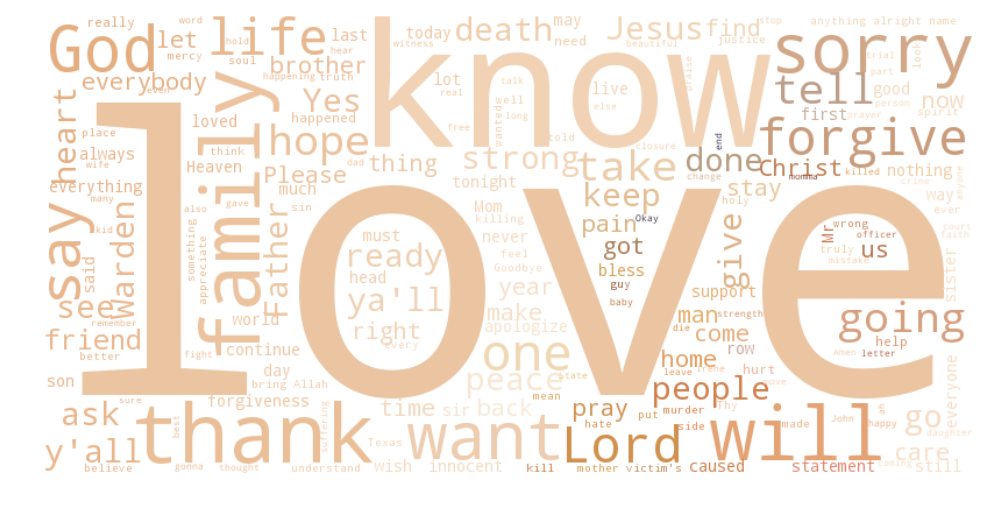
It’s pretty clear that ’love’ is the most frequent word, by far. It’s followed by ‘know’, ‘family’, ’thank’, ‘will’ and religious terms as ‘God’, ‘Jesus’, ‘Father’, ‘Christ’, ‘Lord’. As one could expect, people on the death row thought about family and religion, and their connection with them. Curiously, the most frequent religious terms are almost exclusively Christian (with the exception of ‘God’, maybe). There’s also ‘Allah’ but it’s much less frequent. Let’s check the exact frequencies of the top twenty words:
import collections

counts = collections.Counter(dict(words))
most_common = pd.DataFrame(counts.most_common(20), columns=['Word', 'Count'])
show(Chart(most_common).mark_bar().encode(
        x=X('Word',
            scale=Scale(bandSize=30),
            sort=SortField('Count')),
        y='Count',
        color=Color('Count',
                    scale=Scale(range=['orange', 'darkred']),
                    bin=Bin(maxbins=3)),
    ), height=350)
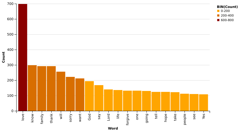
If it wasn’t already clear before, the word ’love’ really is an exception: it occurs more than twice as much as the second ranking word!
From what we have seen until now, we might think that the statements can be roughly divided in two or three groups: those that focus on family, forgiveness and people in general, and those that have religious content. The third group might represent the statements in which the person quickly addresses the Warden and says they are ready or that they decline to give a statement. We’ll check this hypothesis later when we’ll attempt topic modeling.
Sentiment analysis
Before moving on to the last part of the analysis, I’ll insert a brief aside about sentiment analysis. We’ll be using the package textblob, which builds stands on the shoulders of giants (the famous NLTK package), providing at the same time a modern API that is a pleasure to work with. The core concept in textblob is that of a ‘blob’, or a segment of text.
all_sentiments = blobs.map(lambda b: b.sentiment)
The textblob API offers two sentiment metrics:
- the polarity of a document is a number between
-1(completely negative) and1(completely positive); - the subjectivity of a document is a number between
0(objective language) and1(subjective language).
textblob offers the possibility to use NLTK’s NaiveBayesClassifier to classify the polarity of each document. However, NLTK’s classifier is trained on a movie reviews corpus, and the results weren’t satisfactory. For this reason I opted to stay with the default implementation, which is built upon a sentiment lexicon. Each word in the lexicon has polarity and subjectivity scores, along with the intensity of each word. The total score is an aggregate of the single word scores. Although seemingly simple, the default analyzer covers quite a few special cases, including negations and intensity modifiers.
import operator

people_with_stmt = people.iloc[people.last_statement.dropna().index].copy()
people_with_stmt['sentiment_polarity'] = [s.polarity for s in all_sentiments]
people_with_stmt['sentiment_subjectivity'] = [s.subjectivity for s in all_sentiments]
We’ll plot polarity against subjectivity, grouping the data by race. Why? Because usually culture and tradition correlate with race. Even thought the relation is somewhat blurry and there are a lot of other factors in play (for instance, where you grow up has considerable influence on your culture), that is the best we have.
data = people_with_stmt[['race', 'sentiment_polarity', 'sentiment_subjectivity', 'age_execution']]
data = data[data.race != 'Other']
show(Chart(data).mark_point().encode(
        x=X('sentiment_polarity',
            scale=Scale(range=[-1, 1])),
        y=Y('sentiment_subjectivity',
            scale=Scale(range=[0, 1])),
        color=Color('age_execution',
                    scale=Scale(range=['yellow', 'red']),
                    bin=Bin(maxbins=5)),
        row='race',
    ), width=590)
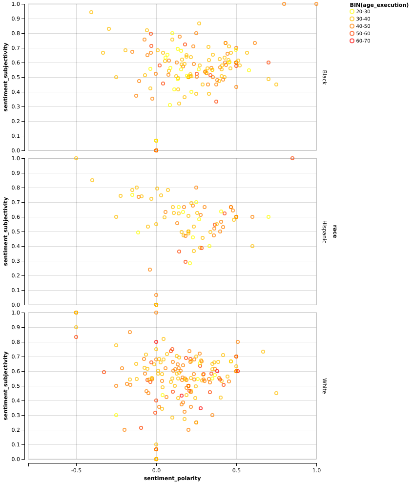
Apart from the fact that black people are generally younger, which we had already found, it’s quite evident that white people’s statements have a polarity much more centered around zero, than the other two groups. Let’s find the mean for each group:
people_with_stmt[['race', 'sentiment_polarity']].groupby(people_with_stmt['race']).mean()
| sentiment_polarity | |
|---|---|
| race | |
| Black | 0.239145 |
| Hispanic | 0.189329 |
| Other | 0.000000 |
| White | 0.125481 |
As we expected from the chart, statements from black people have the highest average polarity, almost double than those from white people! Instead, the subjectivity doesn’t appear to be a very useful metric in this case. All the charts are very centered around 0.5, which represents middle ground between objectivity and subjectivity, and the mean doesn’t surprise us:
people_with_stmt[['race', 'sentiment_subjectivity']].groupby(people_with_stmt['race']).mean()
| sentiment_subjectivity | |
|---|---|
| race | |
| Black | 0.522177 |
| Hispanic | 0.530339 |
| Other | 0.000000 |
| White | 0.487506 |
Topic modelling with scikit-learn
We’ll employ LSA, or Latent Semantical Analysis, to group the statements in clusters. The statements will be vectorized with TfidfVectorizer, in order to obtain a matrix of frequencies. Rows represent the documents, while the columns represent unique words. Every row is normalized with respect to the Euclidean norm. The SVD algorithm is applied with the goal to reduce the number of columns (that is, of features). With fewer columns, the new matrix will have a smaller rank. The consequence of this is that some dimensions are combined and depend on more than one term. Example:
$$(\text{car}, \text{bike}, \text{bicycle}) \longrightarrow (\text{car}, \alpha_1 \times \text{bike} + \alpha_2 \times \text{bicycle})$$
It turns out that the lower-rank matrix that results from the application of the SVD algorithm can be viewed as an approximation of the original matrix, and there’s more: this lower-rank matrix is actually the best approximation among all the other matrices with the same rank. This is extremely convenient: if one assumes that synonym words are used similarly, then the rank-lowering process should merge those terms.
Since we don’t have labeled data, we’ll use an unsupervised algorithm like KMeans, then we’ll validate the results with the silhouette method. But first we have to choose how many features we want to reduce the problem to. For LSA, it’s suggested to have around $100$ features. However, in the earlier iterations of this project, I found that leaving that many features gave very poor results. After some experimentation, I settled on $20$, knowing that it’s particularly low.
from sklearn.pipeline import make_pipeline
from sklearn.preprocessing import Normalizer
from sklearn.decomposition import TruncatedSVD
from sklearn.feature_extraction.text import TfidfVectorizer

vectorizer = TfidfVectorizer(stop_words='english', sublinear_tf=True, use_idf=True)
svd = TruncatedSVD(n_components=20)
pipe = make_pipeline(
    vectorizer,
    svd,
    Normalizer(copy=False),
)

X_s = pipe.fit_transform(people_with_stmt.last_statement)
As expected, the shape of the resulting matrix is $(n_{\text{statements}},\;n_{\text{components}})$:
X_s.shape
(436, 20)
We have now the possibility to check the hypothesis we formulated earlier: the idea was that the statements are roughly divided into three groups:
- the short statements of the people refusing to talk or those saying to the Warden that they were ready;
- the statements which addressed the immediate family;
- the statements with heavy religious content.
Let’s check this hypothesis. We’ll now try different values for the number of clusters (from $2$ to $7$) and visualize the silhouette score of each result.
import matplotlib.cm as cm
from sklearn.cluster import KMeans
from sklearn.metrics import silhouette_score, silhouette_samples

fig, axes = plt.subplots(3, 2, figsize=(7, 10))

for n_clusters in range(2, 8):
    ax = axes[n_clusters // 2 - 1, n_clusters & 1]
    ax.set_xlim([-0.1, 0.5])
    # The (n_clusters+1)*10 is for inserting blank space between silhouette
    # plots of individual clusters, to demarcate them clearly.
    ax.set_ylim([0, len(X_s) + (n_clusters + 1) * 10])

    clusterer = KMeans(n_clusters=n_clusters, random_state=2, max_iter=10000)
    cluster_labels = clusterer.fit_predict(X_s)

    silhouette_avg = silhouette_score(X_s, cluster_labels)

    # Compute the silhouette scores for each sample
    sample_silhouette_values = silhouette_samples(X_s, cluster_labels)

    y_lower = 10
    for i in range(n_clusters):
        # Aggregate the silhouette scores for samples belonging to
        # cluster i, and sort them
        ith_silhouette = sample_silhouette_values[cluster_labels == i]
        ith_silhouette.sort()

        size_cluster_i = ith_silhouette.shape[0]
        y_upper = y_lower + size_cluster_i

        color = cm.rainbow(i / n_clusters)
        ax.fill_betweenx(np.arange(y_lower, y_upper),
                         0, ith_silhouette,
                         facecolor=color, edgecolor=color, alpha=0.8)

        # Label the silhouette plots with their cluster numbers at the middle
        ax.text(-0.05, y_lower + 0.5 * size_cluster_i, str(i))

        # Compute the new y_lower for next plot
        y_lower = y_upper + 10

    ax.set_xlabel('Silhouette coefficient (avg. {:.3f})'.format(silhouette_avg))
    ax.set_ylabel('Cluster label')

    ax.axvline(x=silhouette_avg, color='red', linestyle='--')

    ax.set_yticks([])
    ax.set_xticks([-0.1, 0, 0.2, 0.4])

fig.tight_layout(h_pad=2)
plt.show(fig)
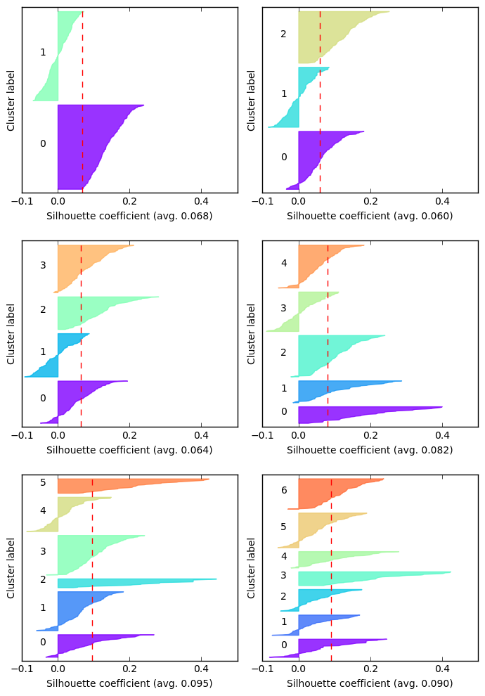
The vertical axis in each subplot represents the statements, grouped by cluster label and sorted within each cluster by their silhouette score. The silhouette score of an element ranges between $-1$ and $1$, where a value of $-1$ means that the element is in the wrong cluster, while $1$ indicates that it’s perfectly clustered.
By comparing each cluster with the average silhouette score we can immediately discard some candidates: with two, three or even four clusters the result is unsatisfactory, since there are clusters almost completely below the average score. Not to mention the negative scores. Among the remaining ones, we choose the one with the fewest negative scores, and that appears to be the one with six clusters, which also has the highest average score.
Let’s see what are the most important words for each cluster.
def print_topics(n_clusters):
    km = KMeans(n_clusters=n_clusters, max_iter=10000)
    km.fit(X_s)
    original_space_centroids = svd.inverse_transform(km.cluster_centers_)
    order_centroids = original_space_centroids.argsort()[:, ::-1]

    terms = vectorizer.get_feature_names()
    clusters = [[terms[ind] for ind in order_centroids[i, :8]]
                for i in range(n_clusters)]
    for i in range(n_clusters):
        print('{}) {}'.format(i, ' '.join(clusters[i])))

print_topics(6)
0) lord jesus amen god praise thank christ home
1) know say did want don just love innocent
2) love thank tell family like friends want warden
3) warden ready statement declined offender make let say
4) ll ya love tell going family everybody kids
5) sorry family hope forgive peace love like pain
We can recognize the clusters I was talking about before: there’s a cluster with religious statements, and another one which represents all the shorter statements. The other ones are not as clear. Some mention the word ‘family’, but not other key words like ‘kids’ or ‘wife’. There’s clearly some overlap between the clusters, and that reinforces the idea that our hypothesis might be more accurate. We may be tempted to disregard the silhouette analysis and proceed with three clusters, but we’ll be met with disappointment:
print_topics(3)
0) love ll tell thank ya strong want family
1) warden statement ready know did say want let
2) sorry family love forgive hope like god thank
The topics are not at all like we envisioned, and there’s too much overlap. It appears that six clusters is indeed a better model.
Other scikit-learn models
I also tried to fit a MeanShift model and a DBSCAN model. Unfortunately, the results weren’t acceptable: the first one was either finding ten (or more) clusters or just one. The latter yielded slightly better results (at first sight), finding three clusters, but that was misleading: $97%$ of the data was classified in the same cluster. For these reasons I dropped them and I won’t show the code here, although it’s very similar to what we have just done with KMeans (the scikit-learn API is amazingly consistent).
Topic modelling with gensim
Finally, I wanted to try out gensim, which is a package built specifically for topic modeling. The first thing to do is tokenization.
from gensim.utils import smart_open, simple_preprocess
from gensim.parsing.preprocessing import STOPWORDS

def tokenize(text):
    return [token for token in simple_preprocess(text) if token not in STOPWORDS]

tokens = people_with_stmt.last_statement.map(tokenize).values
Then we have to create a Dictionary, which contains all the unique words and provides the method doc2bow to convert a document to its bag-of-words representation: a list of tuples (word_id, word_frequency).
from gensim.corpora import Dictionary

dictionary = Dictionary(tokens)
corpus = [dictionary.doc2bow(t) for t in tokens]
We can now build an LSI model, which stands for Latent Semantic Indexing and is equivalent to LSA, which we used before. We’ll build the model with three clusters.
from gensim.models import TfidfModel, LsiModel

tfidf_model = TfidfModel(corpus, id2word=dictionary)
lsi_model = LsiModel(tfidf_model[corpus], id2word=dictionary, num_topics=3)
[(label, [word[0] for word in words])
 for label, words in lsi_model.show_topics(num_words=7, formatted=False)]
[(0, ['ll', 'love', 'thank', 'ya', 'sorry', 'family', 'ready']),
 (1, ['ll', 'ya', 'tell', 'peace', 'kids', 'miss', 'lord']),
 (2,
  ['statement', 'declined', 'offender', 'ready', 'warden', 'final', 'ahead'])]
The result is quite different from what we got from KMeans. Here, the clusters are slightly better defined: one for shorter statements directed to the Warden, one for the family and lastly one with mixed words (even from a religious lexicon).
Wrapping up
We analyzed a very interesting dataset, and even though it was fairly small in size, it provided us with quite a number of thought-provoking insights that could be the starting point for further analysis. The goal of this exploration wasn’t to reach a definitive conclusion about the dataset, but rather to put together different aspects of data analysis and visualization. This was also an opportunity to acquaint myself with various Python libraries.